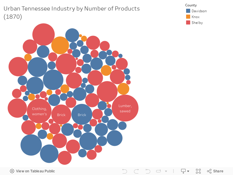
The above chart shows the industries that dominated the three largest urban counties in Tennessee: Shelby, Davidson and Knox in 1870. The color of each bubble indicates the county (see legend) and the size of the bubble is relative to the number of products produced for that industry. Although only some text within the bubble is visible at the onset, simply hover over a bubble to see what industry that bubble represents including the number of employees. For example, the largest red bubble (on the far right) indicates that Shelby County’s lumber industry produced the highest number of products (634,000) with 249 people employed in 1870, compared to Davidson and Knox counties. The largest blue bubble (lower left) indicates that Davidson County’s newspaper printing industry produced the most products (341,500) with 157 people employed, compared to that of Knox County’s same industry with 524,300 products produced by 173 employees.
This type of observation can lead to other questions on which urban Tennessee industries were profitable in this time period and how or if that affected other transformations taking place. Tennessee Industry (1870) data was minded from the